 Tobi Fadolapo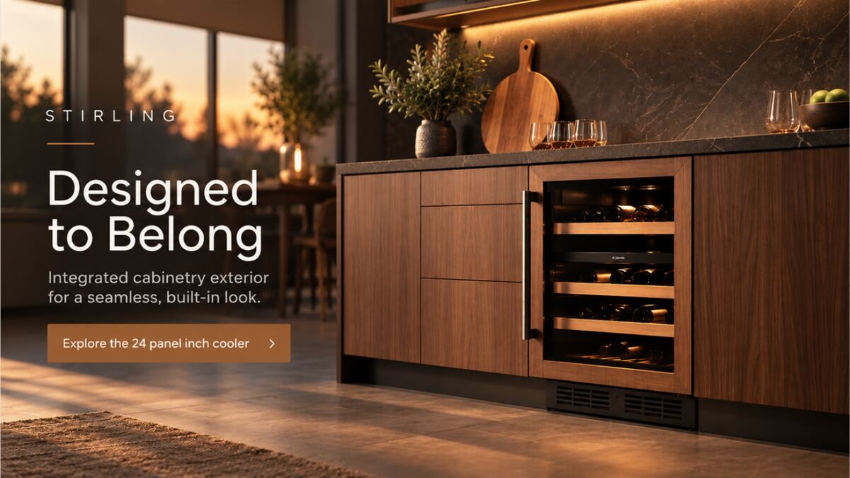
- Challenge
- Panel-ready integration is the product's best feature and its hardest to sell, because shoppers cannot picture it in a finished kitchen.
- Audience
- Design-conscious homeowners and renovation planners, split into renovation interest and entertaining interest.
- My role
- Strategy, creative direction, art direction, content planning, copywriting, retail activation and the measurement framework.
- Status
- Conceptual. Fictional brand, illustrative specifications and budget, never produced or media-tested.
The brief
A premium undercounter beverage cooler is a strange thing to sell. It competes with wine fridges, with ordinary refrigerators, and with every other way a homeowner could spend a discretionary renovation budget. Its best feature is that you cannot see it: panel-ready construction means the door takes the same timber as the cabinetry around it, so the appliance disappears into the kitchen.
That created three barriers at once.
- A product barrier. Panel-ready integration is valuable but almost impossible to visualise from a specification sheet.
- A shopper barrier. Customers do not necessarily know why they need dedicated beverage storage, or how it fits a cabinetry plan they are still drawing.
- A retail barrier. Sales associates need proof points and display tools that turn a technical specification into a lifestyle benefit, in the middle of a showroom conversation.
So the campaign task was narrow and useful: make the cooler easy to imagine, easy to understand and easy to ask about, both online and in the showroom.
From insight to platform
Homeowners want a sleek, clutter-free kitchen. But hosting guests requires extra storage and fridge space that is hard to hide. The audience tension
The resolution was to stop selling a second fridge and start selling an integrated design feature. Stirling turns beverage storage into part of the room, which answers both halves of the tension at once: the kitchen stays clean, and the house is ready for people.
That became Designed to Belong. Ready to Host. The first half carries the design argument — panel-ready construction, Canadian black walnut trim. The second half carries the utility argument — 108 or more cans, controlled temperature, organised storage. The emotional payoff sits underneath both: a home that feels considered, capable and ready for the people who gather there.
Tone throughout is refined, warm, confident and quietly premium. Nothing shouts, because the product's whole proposition is that it does not shout either.
One idea, two ways in
Rather than one hero execution, I built two, each aimed at a different purchase motivation, so the campaign could learn which argument actually moved people before the budget was committed.
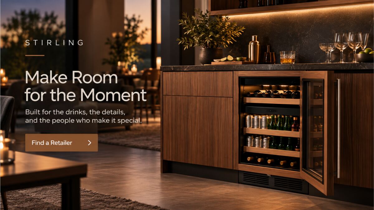
The same split runs through the whole test matrix: core message, creative lead, call to action, audience targeting and email subject line, each with its own decision metric so a winner can be called on evidence rather than preference.
The social system
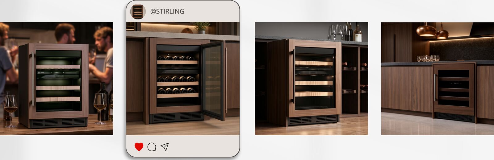
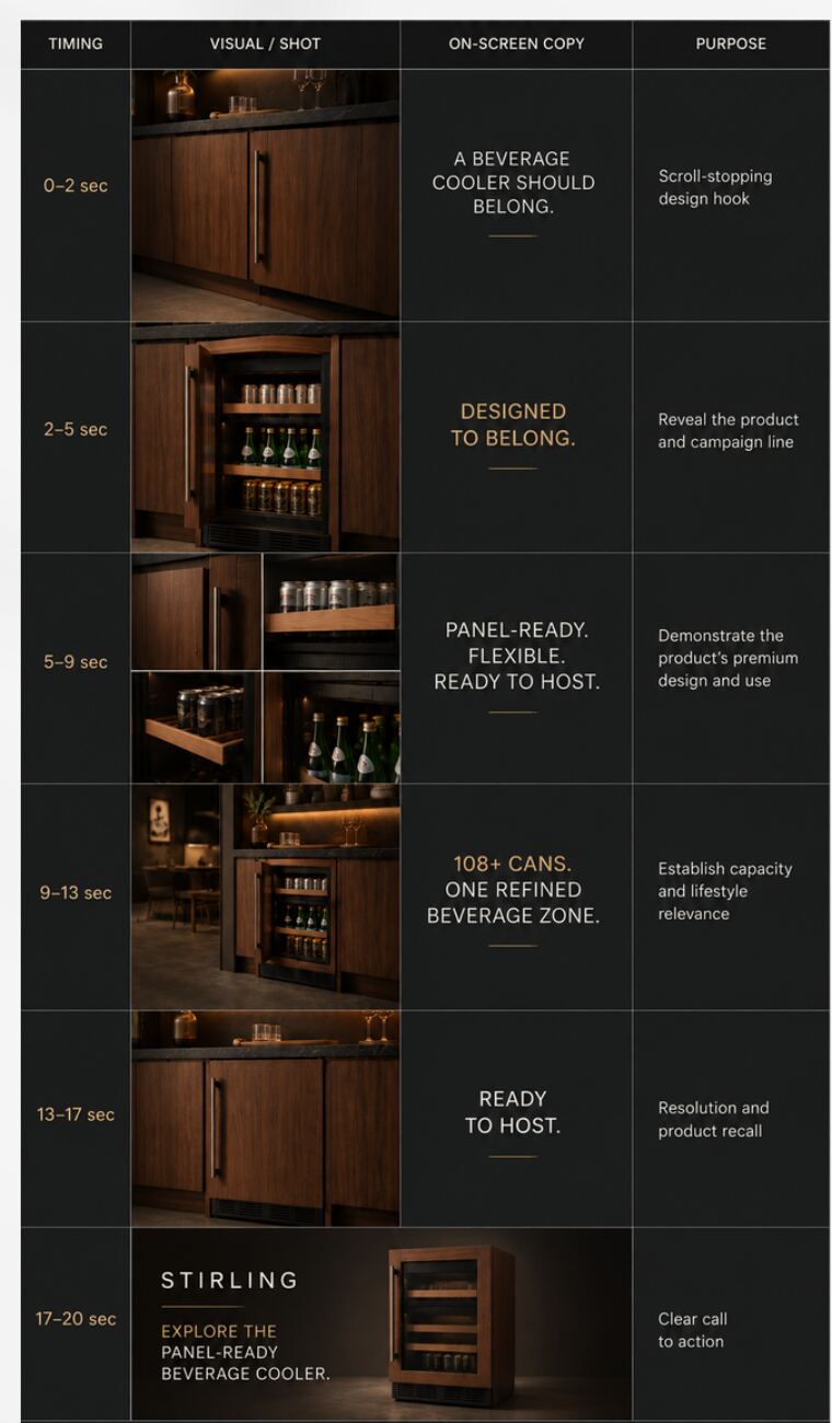
Social carries the discovery job. The carousel establishes the product as part of the room rather than an appliance added afterward, and the short-form video follows the pattern that actually works in feed: hook, benefit demonstration, proof, next step.
E-commerce and CRM
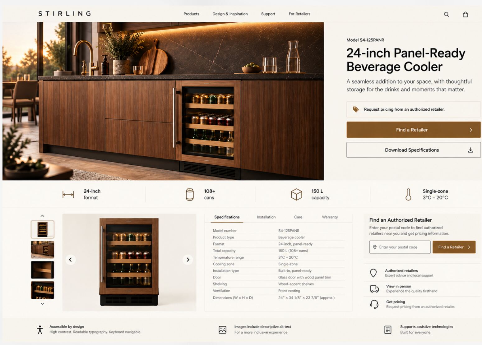
Social sends traffic to a product page whose only job is to make a high-consideration purchase feel plannable. Model number, capacity, temperature range, dimensions and installation type are organised for scanning, with find-a-retailer and download-specifications as the two primary actions.
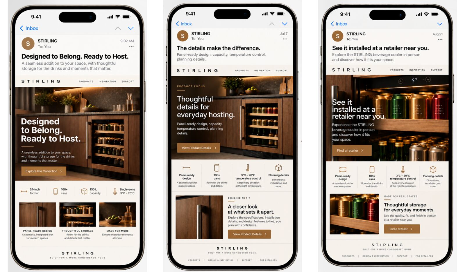
The email flow then sequences proof over three weeks instead of delivering it all at once, because nobody specifies an appliance on the day they first see it.
- Email 1 — Reveal
- Launch day. Create awareness on the campaign line. Call to action: explore the collection.
- Email 2 — Proof
- Day 7. Build consideration on panel-ready design, capacity, temperature control and planning details. Call to action: view product details.
- Email 3 — Action
- Day 21. Convert interest with “See it installed at a retailer near you.” Call to action: find a retailer.
The showroom, which is where it is actually sold
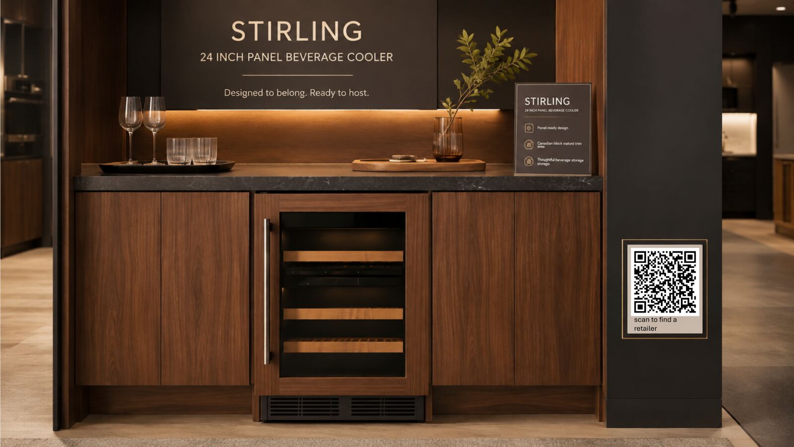
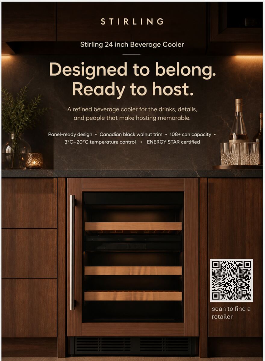
A panel-ready appliance is bought in person. The retail work is therefore not an afterthought in this plan — it is the conversion step, and it has its own small toolkit with a defined user and job for each piece.
- Showroom vignette
- For the shopper. Lets them see the product in a finished environment instead of imagining it.
- QR landing page
- For the shopper. Specifications, dimensions and product story, on their own phone, at their own pace.
- Product sell sheet
- For the sales associate or designer. Supports feature explanation and the follow-up conversation after the customer leaves.
I also wrote three sales prompts for associates, because the hardest part of a showroom conversation is opening it: “Would you like beverages accessible from the entertaining zone instead of the main refrigerator?”, “Are you planning panel-ready appliances to coordinate with your cabinetry?”, and “Which beverage formats do you host with most often — cans, sparkling water, wine, or larger bottles?”
How it would be measured
A thirty-day launch is short enough that measurement has to be designed before anything runs, not retrofitted afterwards. The tracking stack in this plan connects campaign activity to product interest, retail readiness and conversion signals.
- Tagging
- A UTM naming convention by channel, asset, audience and campaign phase, so every click can be attributed without guesswork.
- GA4 events
view_product,click_retailer_locator,download_sell_sheet,qr_landing_page_view.- Audiences
- Meta Pixel and Pinterest Tag for landing-page and retargeting pools.
- Retail attribution
- QR codes unique to each retail location and display type, which is what makes in-store activity visible at all.
- Reporting
- A weekly dashboard covering reach, engagement, site sessions, call-to-action clicks and assisted retail activity.
- Investment
- An illustrative notional budget of $50,000 across paid, owned and earned activity over the thirty days.
What I took from it
The constraint. A high-consideration, panel-ready product needs the campaign to communicate design aspiration and installation confidence at the same time, and those two things pull in opposite creative directions.
The decision. I led with the lifestyle platform rather than the specifications, then sequenced the proof points through the product page, the retail display and the sell sheet, so the technical argument arrived once someone was already interested.
The learning. In premium appliance marketing, visual integration earns the attention, but product accuracy, installation clarity and retail enablement are what support conversion. The beautiful half of the work does not close the sale.
The next iteration. Test design integration against hosting utility as the primary acquisition message, then use the performance data to refine the media mix and the landing-page hierarchy.
This is a conceptual campaign. Stirling is a fictional brand created for an academic portfolio project. Product specifications, budget, media mix and performance benchmarks are illustrative and would be refined with real retailer coverage, audience data, creative testing and launch results.
Produced with Canva, Midjourney, ChatGPT and Perplexity. Campaign imagery was generated with AI tools as part of concept development, in the same way a comp or a mood film is used to sell an idea before production.
Got a brief that needs taking from insight to shelf?
I am looking for a creative marketing role with a Canadian agency or in-house team. The fastest way to reach me is email, and I reply to everything.